While we were working on Royal TS V2 we were aiming for classic menu and toolbar approach. We soon realized that the menu and toolbar concept doesn’t really scale well, especially when you consider additional connection types coming to Royal TS in the future.
We realize that the Ribbon will cause some discussion and it’s a matter of taste but looking at it objectively we learned that there were more pros than cons. In fact, I now believe that the ribbon doesn’t have any cons – except when it comes to individual taste. When you make software it’s impossible to make everyone happy but we try hard to achieve this anyway.
So here are the design decisions behind the Ribbon and some arguments explaining why we think this is a better approach.
Scalability and Continuity
When I look at the Visual Studio UI there’s one really annoying thing: constantly changing toolbars. Toolbars come and go, depending on the context. Here’s an example:
This is the toolbar configuration when you’re in the WinForms designer:

Here’s the toolbar when you are editing a C# file:

As you can see above, toolbar items come and go. It makes them hard to find because depending on the context the item location is constantly changing.
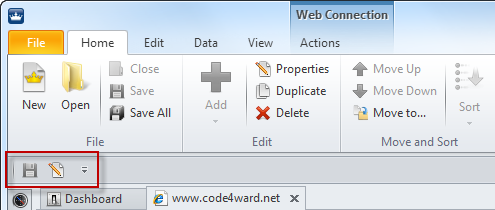
In Royal TS we also have context changes. We need different commands in different situations. For example, a Remote Desktop connection offers a special set of commands and a Web Connection has its own set of commands. Now imagine having 5 or 10 or more different connection types (we are definitely committed to provide more connection types in the future!). It just doesn’t scale well and the UI would be a mess. So here’s the Royal TS example using context tabs on the ribbon:
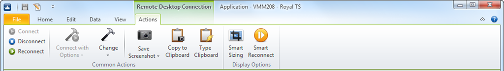
A Remote Desktop Connection offers a context tab called Actions which is only visible when a Remote Desktop Connection is selected. As you can see, it offers some common commands (like disconnect, reconnect, etc.) and some Remote Desktop specific commands: Smart Sizing and Smart Reconnect. Here’s how it looks like:
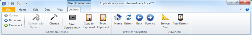
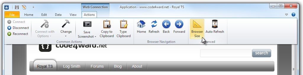
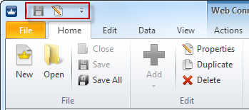
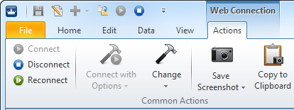
A Web Connection offers also an Action context tab – again only visible when a Web Connection is selected. In this case we are interested in a different set of commands. We want to control the browser (refresh, back, etc.), the browser size and the auto refresh settings:
We think this is a much better approach. This solution is truly scalable and ensures continuity – more importantly, it doesn’t mess up the UI, even when we extend Royal TS in the future.
Screen Real Estate (or Flexibility for different Screen Resolutions)
Let’s face it, displays are getting bigger and bigger, even for notebooks and laptops – at least in terms of screen resolution. Widescreen (16:9 or 16:10) is the new standard screen aspect ratio now. For those high resolution screens the ribbon allows much better readability and offers better usability because it allows you to use bigger icons. In general it’s safe to say you can navigate faster and easier using the ribbon. In the end, the ribbon is a hybrid of menus and toolbars. So if you are on a smaller screen you can reserve more space for your remote sessions by collapsing the ribbon.
Here’s an example how to maximize your space for remote sessions by collapsing the ribbon and by auto-hiding the navigation palette:
Lots of users asked for ways to maximize space for the remote sessions and we think this is the solution. To access your commands you just click on the ribbon tab to slide it out and let it overlap your session temporarily until you’ve found and selected your command:
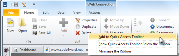
Customizable Toolbar
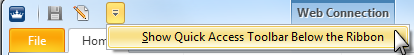
As you may already know, the ribbon also offers a toolbar for you to place your favorite commands on it. This way you have quick and easy access to those commands without navigating the ribbon. The toolbar can be placed “within” the ribbon in the “title bar” (the default setting) or below the ribbon (very similar to the old toolbar).
By default the toolbar is embedded in the “title bar”:
You can easily place the toolbar below the ribbon:
To get this:
Now having the ribbon collapsed, it looks almost the same like in Version 1.x:
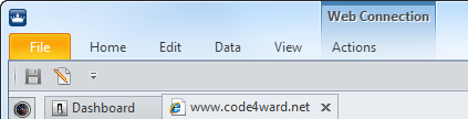
The only real difference is, clicking on a ribbon tab doesn’t show a menu, instead it shows the ribbon with all the commands.
But there’s more, of course. You can now customize which commands you want on the toolbar. Most commands are supported on the toolbar, some are not. Just right-click on a command and choose to place it on the toolbar:
After you’ve done that for the commands you like a toolbar could look like this:
Conclusion
During development we were very skeptical about using the ribbon. We weren’t really comfortable with it at first. When we were challenged with designing the menus and toolbars, we were stuck. It just didn’t work out without making the UI a total mess. We gave the ribbon a shot and we realized soon that it solved all of the problems we faced. I’m still not used to the ribbon in the Office suite – mostly because the office apps are huge I guess. When I was working with Royal TS 2 and the ribbon, I had no issues at all. I hope you feel the same way.
All of you who are concerned with losing screen real estate because of the ribbon, should try to collapse the ribbon and make use of the toolbar. The experience is almost the same as it was in Royal TS V1.x.
The ribbon layout may not be perfect yet. Nothing is set in stone and we can shuffle around some things to make it even more easier and intuitive. I’m looking forward hearing your comments and suggestions. Contact me at stefan.koell (-at-) code4ward.net
Download the V2 preview of Royal TS
Try it yourself: go to http://www.code4ward.net/main/Blog/tabid/70/EntryId/106/Royal-TS-2-0-First-Preview.aspx
cheers Stefan